Table of contents
As a cafe owner, running a successful coffee shop involves more than perfecting your best shot of espresso. It’s about increasing your profits by optimizing every aspect of your business—that includes your coffee shop layout. However, designing cafe floor plans should showcase more than just your eye-catching aesthetics. A well-planned layout can help you maximize customer turnover to increase revenue.
Each part of your coffee shop floor plan plays a crucial role in influencing customer behavior. It’s important to understand your customers’ spending patterns and to create a strategic layout that encourages them to indulge and explore. Since these changes in your layout can impact your business’s success, let’s explore what goes into crafting a great cafe floor plan.
Entrance considerations
Research shows that as many as 90% of customers turn right when first walking into a store. This is a phenomenon known as the “invariant right.” Use this natural tendency to your advantage by showcasing your best-selling or main products immediately against the wall to the right of your entrance. This may be the best area to show off your merchandise, such as cups, mugs, or prepackaged coffee beans.
Use shelving strategically to increase profits on your merchandise by placing your most expensive items at eye level. A common phrase in the merchandising industry is “eye level is buy level.” Instead of forcing customers to bend down or stand on their tiptoes to reach for an item, they’re more likely to grab an item right at their eye level (or just below) since it’s easily within reach. Give your display marketing a chance to meet your customers where their eyes naturally land. Show in-store signage that’s bright and utilizes color theory, such as using red to signal a feeling of urgency to buy now.
Efficiency in customer flow
Streamlining the customer flow within your cafe is one of the most important steps to ensure a positive customer experience. By understanding the steps a customer will take as they walk through your doors, up to the counter, and back to find a seat, you can guide them through a path that encourages behaviors you want them to take.
Make it easy for your customers. After turning right and passing the first display wall, customers should be welcomed with merchandise and products that are showcased in such a way to bring them through the store naturally. Consider placing your checkout on the left side of the cafe to create a forward-moving flow throughout the store.
To create a more efficient line, display your food items, merchandise, and other products where customers can see them before they order coffee. Make sure that the displays remain orderly and that baristas and staff check continuously for any restocking needs. As your customer line passes right beside these displays, it’s more likely that your customers will begin to add extra items to their orders.
To capitalize on one of the most important drinks in your cafe, an espresso, make it front and center in customers’ minds. Showcase the espresso machine where they can see it easily when waiting in line. If they’re not immediately sold on an espresso, be sure to display a menu behind your baristas and the counter that is large enough for your customers to read while waiting in line. This sets up a smooth interaction with the barista since the customers can have their menu items ready in their minds when they order. Including last-minute items such as candy bars and small treats at checkout can inspire spur-of-the-moment purchases to increase sales.
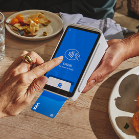
To keep the line moving, establish an efficient process between staff and customers with a powerful, intuitive point-of-sale system such as Square POS software. Square accepts all forms of payment to expedite the payment process, and the point-of-sale software makes it quick and easy for your staff to select drinks, to add modifiers, and to complete orders.
Efficiency in seating
Your cafe’s seating capacity directly impacts your revenue. If your cafe floor plan allows for it, separate the seating from the waiting area. Maintain seats around the cafe’s perimeter, leaving the center of your cafe more open. That approach keeps people from feeling crowded and bolting out the door. Instead, they’re likely to stay longer to relax and enjoy their coffees, increasing the likelihood that they make additional purchases.
If your coffee shop floor plan has the space, invest in comfortable seating, low coffee tables, Wi-Fi, and sufficient electrical outlets for laptops. This setup encourages customers to work remotely from your cafe, to socialize, to linger a bit longer, and to spend more in refill drink and food orders. On the other hand, if your cafe has limited space, consider catering to customers who prefer a quick coffee break of a coffee to go. Minimal chairs or stools provide customers a place to sit while they wait, making it easy for them to come and go. There’s also the option to do away with seating altogether. Instead you may prefer to fill the space and add personality with unique decor or entertaining displays, such as a book about coffee.
If you do decide to furnish your coffee shop, you may want to avoid couches. Often they take up too much space and restrict serving the maximum number of people. It’s helpful to use smaller, two-top tables instead of larger, longer tables, which increase the risk that only a few people will occupy any given table and waste space for others to use. Simple changes like these can help make the most of your cafe floor plan so that you can maximize your profits and create a better experience for all.
Designing for ambience
Now that you have the floor plan mapped out, it’s time to focus on the overall feel of your cafe. The right ambience in your coffee chop can significantly influence customer behavior and time spent within your business.
Set the tone of your business by choosing music that reflects your brand and your overall business. Soft background music, such as jazz or instrumentals, reflects a calming and soothing cafe suited for work. Playing a top 40 radio station or pop playlist can reflect a fun and hip gathering spot for friends. The right music can make customers more comfortable and encourage them to spend more time and money in your cafe. In fact, 41% of customers in the U.S. were found to spend more time (and potentially more money) in a retail location if they enjoyed the music, and coffee shops were among the top businesses picked because of the music choice.
You can also use lighting to call out displays or items you want your customers to focus on. Illuminating these products and displays with bright lighting makes it easier for customers to evaluate the products, both from close-up and from afar if waiting in line or sitting across the cafe. Just be sure that the bright lights don’t overwhelm the overall ambience you want to create in your cafe.
Implementing these strategies alongside Square point-of-sale software can create an inviting and profitable cafe environment, attracting more customers and increasing revenue. Encourage the long-term success of your cafe by carefully planning your well-designed coffee shop layout, and watch as your business continues to thrive.
![]()


