Table of contents
Your restaurant’s website design can have a big impact on your sales. In 2019, an MGH survey found that 77% of customers check out a restaurant’s website before dining out and, of those, 68% of people have been discouraged from visiting a restaurant because of its website.
As restaurants have turned on online ordering in droves, those website views are even more pivotal. Square’s 2022 Future of Restaurants report found that restaurants that offer online ordering say an average of 34% of their revenue comes from online takeout and delivery channels.
What are the must-have features for a great restaurant website design? The biggest consideration is making pertinent information easy to find, and getting across the quality of your food to consumers making decisions about what to eat. Here’s a list of features some of the best restaurant websites include that teams should consider when creating their own restaurant website design.
Prominent name/address/phone and contact information
You want people to be able to easily find where your restaurant is located and how to reach out to you. Make sure you include the city and state as well as your street address, since people may land on your site from anywhere.
You can add your name and address in the footer of every page, or make it even clearer by having a “Contact us” section where you can also include your phone number and an email address or contact form. (If you want to make it easy for press to reach you, then include an email address.)
Additionally, include your hours of operation. While you’re adding this to your website, don’t forget to make sure you have an updated Google My Business profile with the correct information.
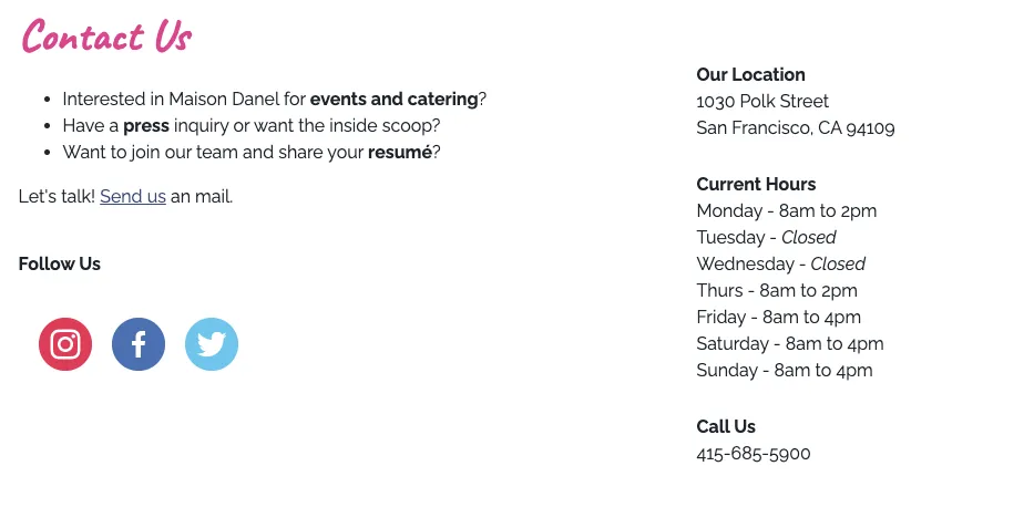
The Contact Us section on San Francisco’s Maison Danel homepage provides all the information customers need.
About us or Our story
This is the place for your restaurant’s personality to really shine.
- Has your restaurant been in the family for three generations?
- Are you serving food that’s unique or hard to find?
- Do you have a food philosophy?
- Is there an interesting tale about why you decided to open the restaurant?
Share your story the way that you would tell it to a friend. Many customers want to have an emotional connection with where they eat.
“I think that’s one of the main things that you have to have on your website; it’s your story,” says Andrea Aldave, owner of The Art of Donut in San Antonio, Texas. On her About Us page, Aldave shares her food philosophy, letting customers know the quality of what they serve.
“Customers want to know where you’re coming from; how did you start? What are your values? How is your food different? Whenever I go to a restaurant or even a coffee shop, I normally try to look at that section to see how they started. As a customer, I think it creates a personal connection and gets you more excited about the business.”
Menu items with descriptors
Include a menu on your website; if possible, add it as written content on your site rather than an image or PDF. That way, search engine bots are able to crawl that content. So if someone is searching for lobster rolls in San Francisco, and you happen to have lobster rolls on your menu and a location in San Francisco, your restaurant may surface as an option.
Some restaurants will link their menu to delivery sites rather than have one that’s on their site. But food lovers enjoy perusing menus and planning visits around your menu, so have it right on your site and make it easy to find to provide a better user experience.
You also have as much room as you need to describe the dishes. Include details about ingredients and, if possible, whether dishes are friendly to common dietary restrictions such as vegetarian, vegan, gluten-free, or nut-free.
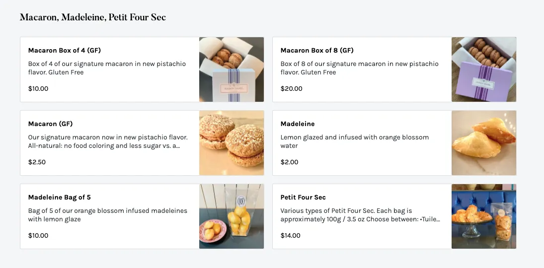
The menu for Maison Danel includes photos and mouthwatering descriptions.
Online ordering
With Square you can enable online ordering, allowing customers to place orders for pickup or delivery right on your site.
After experiencing the efficiency of online ordering during the pandemic, customers now expect it. And in fact, according to Square’s Future of Restaurants report, 67% of consumers prefer to use a restaurant’s own website or app for food delivery rather than a third-party app.
It’s also efficient for you as a business owner, as you can free up staff who might otherwise be taking orders over the phone. Customers can also see when dishes are unavailable. Additionally, having an online ordering page also allows you to turn on QR code ordering, which is incredibly useful for contactless, on-premise dining. Customers are able to scan the QR code, go to your online ordering page, order their food and pay, allowing your staff to take on other tasks.
Be sure to specify all the options you have, including online ordering, curbside pickup, pre-ordering and delivery.
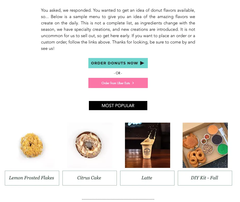
The Art of Donut offers online ordering, and makes it clear what platforms they are on.
Reservations
Make it easy for customers to book reservations right on your site rather than having them hunt down your restaurant on different platforms. You can add a reservations page to your top navigation or include a reservation section on your “Contact us” page.
Photos and/or videos
Bold images or videos of your food immediately get potential customers’ attention.
- Of course, people eat with their eyes, so beautiful food photography is integral to a restaurant website.
- Additionally, consider having images of your chef and other staff (with their permission), showing kitchen operations or service.
- Showing the interior of your restaurant can also help customers know what to expect. Is the restaurant casual or fancy? What’s the vibe? Is there an outdoor space? These images help customers visualize themselves in your restaurant.
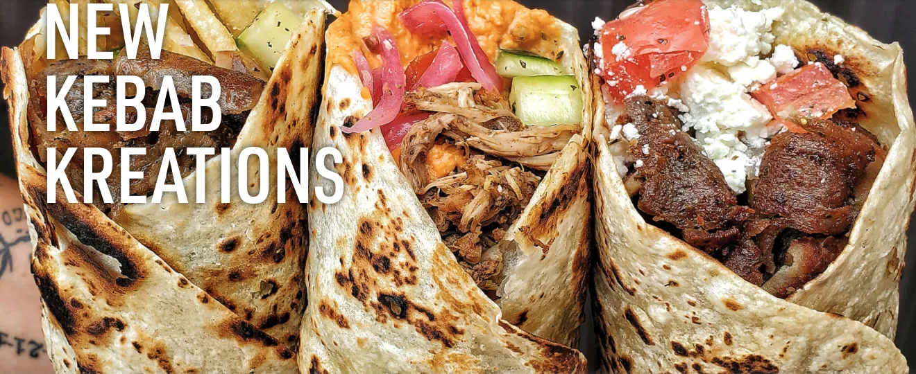
The Kebab Shop features drool-worthy photos and videos right on their homepage.
One note: Having low-quality images will have the opposite effect, turning customers off or leaving them questioning the quality of your establishment. It’s OK if you can’t photograph your whole menu; focus on having a few professional-looking, drool-worthy images that make your site pop to start. Eventually, having more images can help with increased orders.
If you don’t have the ability to take your own photos, Square Photo Studio may be able to help, particularly if you sell packaged goods like meal kits or sauces.
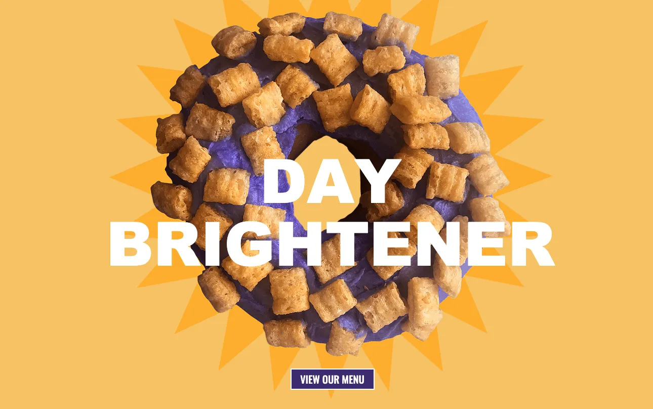
The Art of Donut features a colorful designer donut on their homepage.
Social media presence
Link your social media accounts to your website so that inquisitive customers can learn more about you and follow you.
If your posts on a particular account are robust, like on Instagram or Twitter, for example, consider embedding the feed on your site so customers can get more of a taste for your restaurant’s personality and can easily keep up with any promotions or specials.
![]()

