Table of contents
When you own a business, conveying your brand personality is one of the most exciting tasks you get to do. From choosing the colors for your walls to selecting the decor — and even deciding what to write on that funny chalkboard sign outside the door — details bring a business to life for customers and showcase your unique point of view.
Your website is another opportunity to connect with visitors. It’s like a blank canvas where you can infuse your brand personality in even more ways.
Having a good online presence is more important than ever. While consumers are spending more time online, they still crave an engaging experience. Giving your customers a sense of personal interaction can become a competitive advantage.
Here are eight opportunities to showcase your brand’s personality.
1. Tell your story on an About Me page
The About or Our Story section of your website is the perfect place to share what makes your business stand out. While most About Me pages include a business mission statement and entrepreneurial journey, you can bring yours to life by using a conversational tone that represents your brand and helps you connect with customers.
Some business owners choose to use humor. For example, the owners of Lost Cause Meadery, a San Diego-based mead tasting room, joke about being confused with a “meatery” and give themselves nicknames (Worker Bee and Queen Bee). After reading the About Me page, you get a sense of their humor and personality.
You can also share a unique backstory. For example, the mother-son founders of Comeback Vinyl admit on their About Me page that neither had experience in retail when they opened their Alpharetta, Georgia, record shop; instead, it was their love of music that helped them bond and start their venture together.
2. Bring your story to life with video
Video is also a good way bring your story and personality to life. A good example is Nong Poonsukwattana, owner of Nong’s Khao Man Gai. She has a few videos on her website, including one in which she shares her journey as an immigrant from Thailand, coming to the United States as a child, and eventually realizing her dream of opening a restaurant. By sharing her story in the first person, Nong helps create a strong connection with customers.
Or check out Molly Moon’s story: The owner of Molly Moon’s Ice Cream shares that her love of the frozen treat came from her grandfather. The upbeat video also features some of her vendors and their commitment to fresh food, giving you a glimpse of what it would be like to visit one of the company’s eight Seattle-area locations.
3. Pick eye-catching colors
The colors you choose for your website design are also an integral part of your brand personality. For example, light, cool colors, like some shades of green and blue, provide a serene feel, while bold colors, like certain shades of red and orange, inject a sense of energy. The colors you use online should mirror what a customer would find if they visited your brick-and-mortar location.
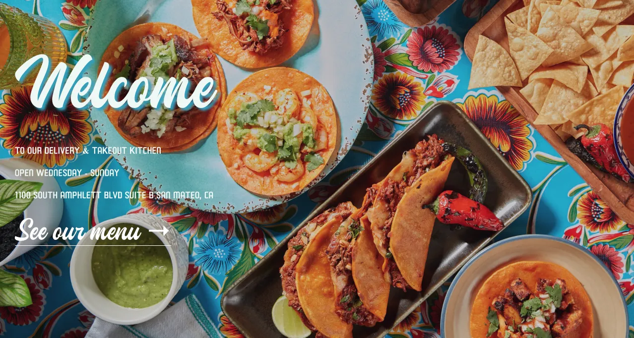
A good example of color use is Suavecito Birria & Tacos, a restaurant located in San Mateo, California. Vibrant reds and blues are used in the text and in the colorful background. Velve Beauty, a salon in Woodbridge, Ontario, sets the tone for its brand personality with color, too, featuring a soft pink background. The site also includes photos of the salon, which is decorated in the same shade.
4. Get creative with imagery
Using high-quality images helps your business come to life, but you can add personality by giving them a twist. For example, hand-drawn illustrations can be an unexpected visual for visitors who come to your site. Or you can use fun interactive graphics like Dutch Kills Bar, whose home page features a photo of the New York restaurant’s front door with bold text and vintage illustrations that you click on to navigate the site.
Adding pictures of your team can also connect with customers, especially if the photos have some personality and go beyond the standard headshot. Bulldog Sports and Fitness, a family fitness center in Menlo Park, California, uses fun shots of its trainers and clients who are striking poses showing off their muscles. Photos like this give potential customers a feeling for the company’s attitude and energy.
5. Encourage newsletter subscriptions
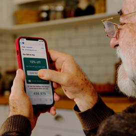
Newsletters are a great way to build relationships with customers, increase engagement, and drive sales. You can infuse your personality not only in the content of your newsletter, but also in your signup box.
Consider the way you invite visitors to subscribe. “Join our mailing list” is straightforward, but what about thinking outside the box and using phrasing that relates to your business? For example, the newsletter signup on Nocturnal Skate Shop’s site says, “Let us slide into your DMs.” The cool Philadelphia skateboard shop underscores its irreverent street vibe by having “[email protected]” as the example in the field where you enter your email address. Lost Whiskey asks visitors, “Interested in keeping up with all of the cool sh** going on at Lost Whiskey?” The email signup form also includes a field called “Whaddya want to know?” where you can ask questions.
Chances are, if customers get a kick out of the sign-up experience, they’ll also be more willing to check out the content that you send.
6. Bring your chatbots to life
Chatbots are becoming a popular way for business owners to provide customer service around the clock. They can quickly answer product questions or track orders. But they can be a little boring as-is. Why not take it to the next level by assigning them a name and personality that matches your brand, bringing them to life?
Create a bio for your bot as if it were a real employee. This will help you build a character who is relatable and appealing to your customers. Then update the standard dialogue with terms and phrases your bot would use that also fit your brand. A bot should be more like a helpful friend to the visitor than a salesperson. If you use your dialogue solely to push products, they’re more likely to click away.
7. Add a playlist
No one wants to visit a website that automatically plays music or a video — especially if they’re scrolling your site while at work. But you can add an element of music that isn’t intrusive — while infusing a bit of personality into your customers’ online experience — by sharing playlists for customers who want a multimedia experience.
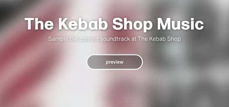
For example, The Kebab Shop, a Middle Eastern-style restaurant with several locations, includes a playlist on their site of the music they play in their restaurants. And Shine Beer Sanctuary and Lapa Grill, a craft beer bar in Bozeman, Montana, has a Spotify playlist it shares called Shine’s Day Brighteners.
Read more: How The Kebab Shop’s Digital-Forward Vision is Leading to Incredible Growth
8. Play with the details
Now it’s time to put some icing on the cake. Bring your brand to life by having fun with the details. Here is some inspiration:
- Rename site pages to fit your brand’s voice and tone. You want your site to be easy to navigate. If a customer can’t find your catalog because you’ve named it something obscure, they’ll likely click away. But you still have room for creativity. For example, The Cheese Shop in Carmel-By-The-Sea, California, calls their FAQ page their FAQQ page, which stands for “Frequently Asked Queso Questions”.
- Use a unique cursor. Choose an icon that fits your business but doesn’t complicate the user experience. For example, The Kebab Shop’s cursor is a butcher knife. A florist could have a flower-shaped cursor, and a salon could use a cursor that’s shaped like a blow-dryer.
- Rethink your 404 error page messages. This is a great place to infuse brand personality. For example, Beau’s Bandanas, a website that sells dog scarves, has a “Go Home” button on its 404 page. You could put a funny picture on your 404 page message or choose a more engaging phrase, such as “Well, this is awkward.”
- Get creative with pop-ups. Websites that sell age-restricted products, like alcohol or tobacco, are required to have a box where visitors confirm their age. However, this feature can add unexpected fun. For example, Nocturnal Skate Shop uses a pop up on its home page to make sure you’re “cool enough” to enter their site, asking, “Can you even do a kick flip, Kyle?” The right answer is the box that reads “Duh.” And if you click the box that says “Don’t Click This,” you’re told you’ve just wasted time and to refresh and say you have street cred.
Now it’s your turn
With these ideas in mind, identify the elements of your website that could use a little dose of creativity. Being deliberate about how you come across online also helps give customers a sneak peek into what it’s like to visit your business in person or on other platforms, such as social media or through your newsletter. If you make a great first impression and engage visitors online, you might just make a connection and build a relationship with someone who turns into a loyal customer.
![]()


