Table of contents
As social distancing continues, it may be time to reconfigure your store layout. Seventy percent of consumers are concerned about being too close to others while shopping for the holidays, according to data from Morning Consult. A thoughtful store layout can help customers browse and buy safely, especially as the holiday season approaches.
Here are some tips on how to revamp your store layout, along with examples from retailers who are bringing creativity to their store configurations.
Remove unnecessary displays
Social distancing is now the norm in many public spaces, and that includes your store. That’s why one of the first things you need to do when revising your store layout is to make distancing possible. One way to reduce contact is to eliminate doors, half doors, interactive displays, and other high-touch items.
But it’s not the only approach.
Sara Villari is the owner and creative director of Occasionette, an independent gift and card shop in South Philadelphia with another location in New Jersey. For Villari, editing her displays has been key to giving customers enough space to shop. “We’ve removed a few displays to open the space up and make it easier to step out of the way to give the courtesy of space to others,” she described.
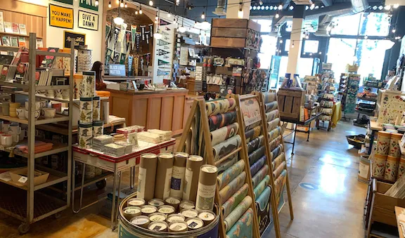
Based in Tacoma, Washington, Stocklist Goods & Gifts carries a wide range of items, from paper goods and greeting cards to kitchen goods and home decor items. Owner Liz Van Dyke agrees that removing fixtures is a great way to allow customers to safely distance.
“It was a tough decision to remove product from the sales floor, but we find folks appreciate being able to move with ease,” she said.
If you’re concerned customers may miss your old displays, consider adding a sign with more details about the products you used to feature and how customers can purchase them in your store or online.
Highlight your best sellers
If you decide to cut down on your displays, you’ll have to make hard choices about the products you do feature.
Check your sales reports in your retail POS system to see which products have performed best recently, and throughout last year’s season. Then place those products in well-lit areas where customers can clearly see them, ensuring you’ll continue to make sales.
At Stocklist Goods & Gifts, Van Dyke rearranged displays to only feature best sellers.
This is exactly the approach Stocklist Goods & Gifts took, said Liz Van Dyke. “We’ve focused on highlighting certain products, creating a strong visual impact with our top sellers.” Decluttering the number of products on the floor can help you draw customers to the specific items you want them to notice.
Create a vertical power wall
Another way to maximize your display space is to use vertical shelving to create a power wall. A power wall is a large, dramatic display that can help orient customers toward your most popular products, while keeping your display footprint minimal.
Consider adding product names, prices, or other markers to your vertical display so shoppers can clearly refer to the exact items they want from a distance.
Don’t go too high, though, or customers may feel hemmed in. And you can put any products you don’t display in storage and add them to your online store inventory.
Guide customer behavior with signage
Changing your retail space is one thing, but what about customers’ natural tendency to want to touch and feel the items they’re thinking about buying?
In the COVID-19 era, physical interaction with products is discouraged. Clear signage can help guide safe behavior and explain changes in store policies, like how to handle merchandise. It also can help you create a transition space at the front of your store, allowing customers to read the sign and take a second to see where they want to go.
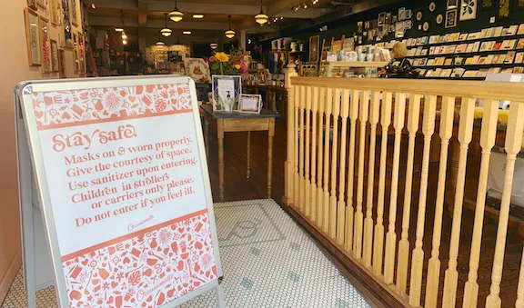
Villari created on-brand signage to remind customers about Occasionette’s updated health and safety protocols.
Villari ensures her signs keep the Occasionette voice and tone but still get the message across. “We have polite (but firm) signs around the shops to remind people to be conscious of how many items they’re touching, and to minimize unnecessary touching throughout the shops,” she said.
Van Dyke adds that there’s another benefit of using in-store signage. “Providing [customers] with a verbal layout and stressing the importance of distancing is important to ensure the safety of your staff.” Not only does this show that you care about your team’s health, but taking measures to keep staff members healthy helps your business continue to operate.
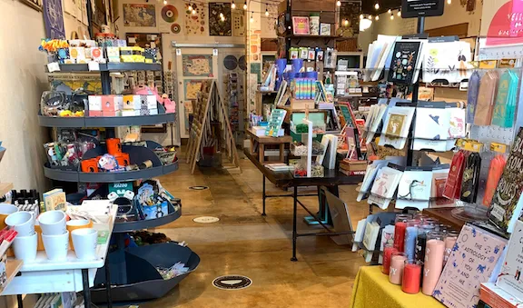
New floor decals at Stocklist Goods & Gifts help customers observe social distancing.
Reduce customer contact with staff
The way staff and customers interact has changed. Instead of employees hovering to answer questions and make sales, reducing contact (while still being attentive) is now the expected way to deliver good customer service.
It’s a delicate balance, according to Van Dyke. “We dialogue with customers, letting them know we are still around to help them if needed. But we let them know that, out of caution, we distance unless folks show they need assistance,” she said.
Clear out space around the areas where you want staff stationed, so you can account for a customer talking to them while keeping their distance. Signage indicating where employees are located can also make it easier for customers to spot staff when they need them, while keeping everyone safe.
Change the flow
One approach supermarkets have used to avoid bottlenecks is creating a one-way customer flow. IKEA pioneered this approach, drawing customers further into the store and encouraging impulse buying.
Some arrow decals on the floor and creative display placements can help you achieve this, and it has the added bonus of allowing customers to see everything you have in stock.
Use outside space
Here’s another tip from the food and services business playbook: Use outside space to create more room. Some salons are serving customers outside, while restaurants have spilled out onto the street so that customers can enjoy socially distanced meals.
Try the same approach for your retail store by extending the shopping zone to the sidewalk or parking areas, if you’re allowed to in your area. You can also set up tents and canopies to provide adequate shelter and keep your products contained.
Add more square footage
Sometimes you can’t pack everything you need into your existing store layout, even with a redesign. The solution? Add more space.
That’s how Occasionette is preparing for this holiday season. “We’re opening a third storefront so that we can spread out product into almost twice the square footage of our flagship location,” said Villari.
Google found that 66 percent of consumers plan to shop more at small businesses during the holidays this year, and Villari is getting ready. “It was a big decision, but I think it makes the most sense for this holiday season,” Villari said. “We do want to make it pleasant, easy, and appealing for people to shop locally this holiday season, as we believe it’s even more important than ever now.”
In contrast, Van Dyke is keeping things pared down on purpose, knowing that customers can also find her products online. “We plan to continue our layout with reduced displays to provide our customers with a distanced shopping experience. They feel more comfortable being able to safely navigate through the store rather than figure out how to navigate if we were to add an extra table or two.”
A thoughtful, spaced-out store layout can help you direct customers to the exact spots you want them to pay attention to. If you change your displays to highlight your best-selling products, guide customers with signage, and get creative with indoor and outdoor space, you can create a more comfortable in-store atmosphere, right in time for the holidays.
![]()

