Table of contents
We know what you’re thinking — you’re not a designer, you’re a small business owner. But we promise, designing email is easy and can actually be fun (honestly) once you have an idea of what you should be looking for.
Important elements of email design
Let’s start with some basic email design principles that can help guide every email campaign you create. Yes, every campaign.
Information hierarchy
Information hierarchy is one of the most important principles to know because it helps you organize the information in your email. This term sounds intimidating, but it simply means that you should put your most important content first, followed by supporting information.
The most important information in your email is your call to action (CTA), asking your audience to take action — whether that is signing up for an event, purchasing a product online, or coming into your store to take advantage of a new sale.
Continuity
Continuity is an important design element because it guides users to see related groupings simply through the way you put your products together. As Smashing Magazine explains, “When designing, we can use continuation to guide the eye through our designs, establishing relationships between elements as well as directing attention to specific groups or elements.”
A good example of continuity is when you see many products gathered together in an email, like this email by Kansas City Marketplace:
Templates
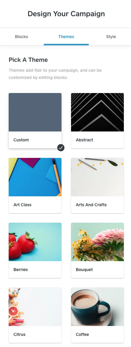
Just so we’re all on the same page, an email template is a preformatted email that allows you to quickly create email campaigns. By using Square’s email templates, you’re able to add content blocks, put in a header with your logo or company name, pick a theme, and set your style. Square has many different beautiful email templates, if we do say so ourselves, for both blast (one-off) and automated campaigns.
For your email campaigns, take your pick of beautiful templates. This is just a sampling of what you can choose from:
Consistency
We may be biased, but Square provides some pretty beautiful design elements to choose from, including dozens of email themes, blocks of content (think headlines, buttons, and images), and email style including color, shape, fill, and font.
It’s important to remember that once you’ve decided on your design elements, you should use them throughout your emails, landing pages, brochures, etc. We’re not saying don’t use green and red for the holidays, for instance, but rather that once you decide on your brand colors, it’s important to use them in your email, along with a consistent text font.
What to do (and not to do) when designing your email
Now that you’re ready to design your email, go to the Marketing section of your Square Dashboard and click Create Campaign. You’ll then be led to choose your template, add your content, pick a theme, and select your email’s style. Make sure you take advantage of the Unsplash integration, which gives you access to hundreds of thousands of free, professional photos to use in your email. Yes, really, all free.
It’s worth mentioning that when you’re selecting a theme, make sure it matches your email content. For example, if you’re sending an email about a new menu item for your restaurant, make sure you select a theme like Kitchen as opposed to one like Office.
It’s easy to get carried away when you’re designing an email, but remember, often less is more. It’s best not to overwhelm your customers with tons of images, headlines, and buttons. If your email has too much content or is brimming with buttons, take a step back and start with the one thing you want your customers to do after they read your email, and then design your email around that one CTA.
Great email designs created with Square
Below are just a few examples of Square’s incredible customers creatively using email design to effectively reach their audiences.
La Colombe
La Colombe does an excellent job of breaking up its email with three different photos and two different graphics. By breaking up the email with photos and design, La Colombe makes it easier for the recipient to read and follow its email design.
It also makes use of a strong information hierarchy by highlighting its CTA, inviting users to buy coffee as gifts for their friends and family toward the top of the email. This is followed by secondary messaging encouraging users to buy coffee for their holiday parties.
Hai Street Kitchen & Co.
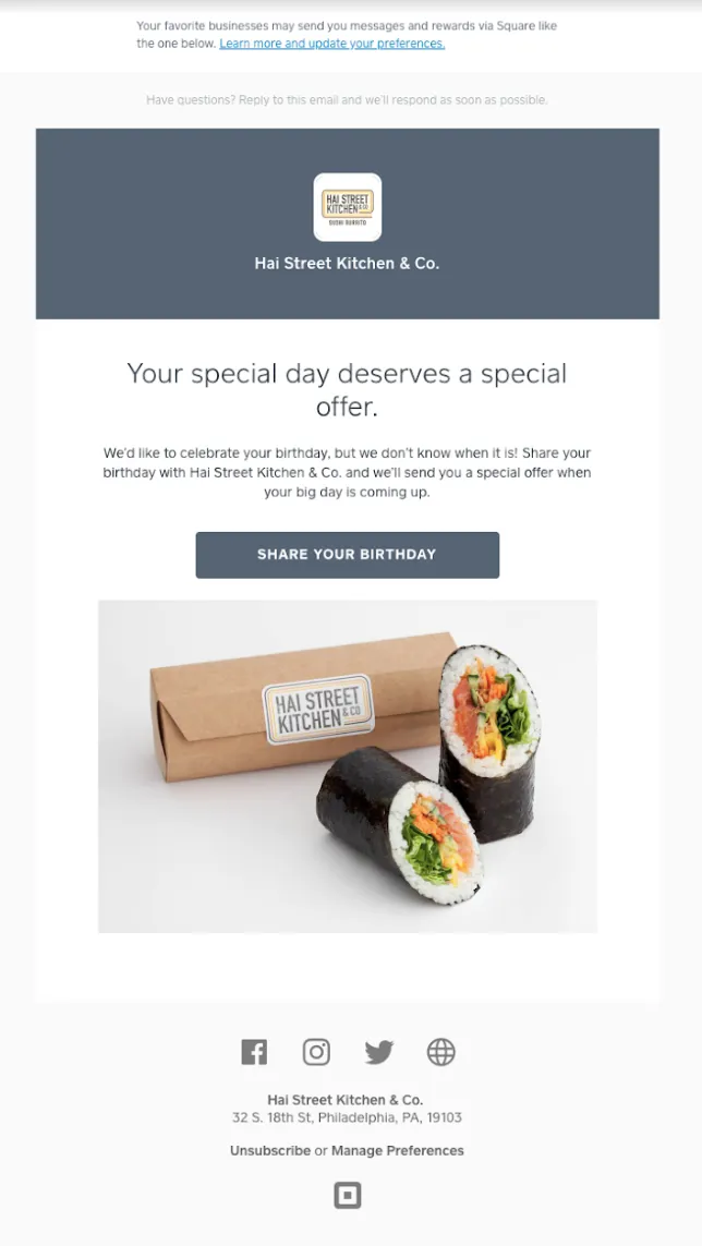
Hai Street Kitchen & Co.’s email is a great example of a simple design with a straightforward call to action. The design uses clean lines and sticks to its brand colors even in its photograph, which is directly below the CTA asking recipients to share their birthdays.
The Vintage Twin
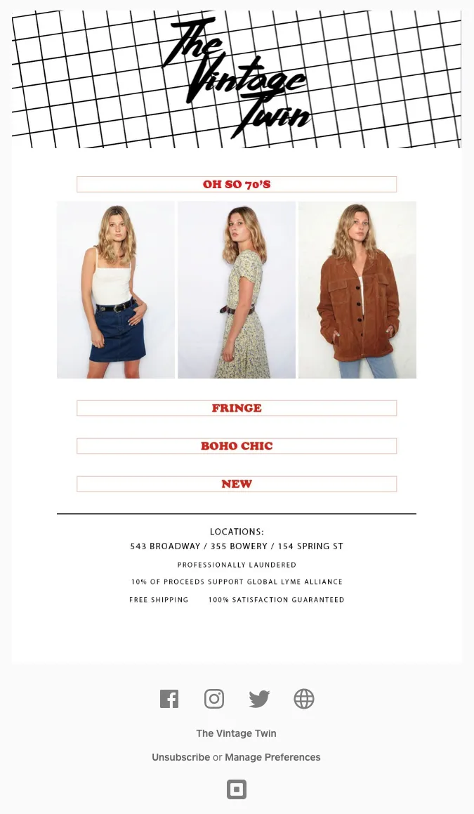
The Vintage Twin takes simplicity to the next level with this email design. Three photos are followed by three clothing categories from The Vintage Twin: fringe, boho chic, and new. Each category is its own CTA, making it easy for recipients to follow.
![]()
