

Table of contents
Crafting the perfect call to action (CTA) button can very often be the difference between making or breaking your marketing campaign. You may have the best sales copy, videos and social media posts in the world, but if you have a poor CTA that doesn’t direct the audience to take the action you want, then all your efforts can fall away.
Whether you’re running a professional services company, selling on an online store or in a brick-and-mortar shop, effective CTAs will always matter.
Below, we’ll outline the meaning of CTAs, the purpose behind them and what the benefits are of having an effective CTA in your marketing campaigns. We’ll then list the various types and provide a set of call to action examples you can use for inspiration.
What is a call to action (CTA)?
A call to action (or CTA) is a written instruction used in marketing campaigns that direct a visitor to take a particular action. This action may be to enter an email address, download something, go to a website, watch a webinar, or purchase something.
Some of the simple CTAs you may see around include “Buy Now”, “Subscribe Now”, “Book a Free Call” or “Download now”. But you might see other (and more creative) CTAs such as “Book Your Call With Me (I Don’t Bite)” or “Get This Insane Deal Before The Weekend Finishes (Or Else You’ll Be Crying When Your Competitors Destroy You in Web Rankings)”. The possibilities are endless.
Benefits of CTAs
Getting your customer moving
The primary (and fairly obvious) benefit of a CTA in marketing is to encourage your customers to start connecting with you. By successfully enticing them to provide their email address, you can launch an email campaign to them. By getting them to download your e-book, you can not only start an email marketing campaign but show your prospect how knowledgeable you are in your field (thereby creating the confidence your customers want before they buy).
Remove confusion
Having a crystal clear CTA to tell your lead what to do next will remove any confusion they may have about their journey. Creating a confusing experience on your website is one of the most effective ways to kill your sales, so you want to be sure your CTA is abundantly clear. A CTA which is vague and, even worse, suggests your lead will be charged money when they won’t be are no-no’s!
Build a following and increase sales
A CTA that’s as simple as ‘Follow us on Facebook’ can effectively build your online following. This can increase the number of people who view blog posts, articles, posts and other content you are producing. It can also help you boost your sales when it comes to the time that your leads are ready to buy. A clear CTA that is straight to the point will get the lead to pull the trigger and purchase, whereas a confusing one will direct them straight away from your website.
Types of calls to actions
There is no such thing as a one-size-fits-all CTA. Below, we’ll outline the different kinds of CTAs you’ll likely see across the internet and what you can potentially implement in your websites and sales funnels.
Lead generation
A lead gen CTA has the sole objective to transform your online visitors into leads. A good place to put them would be really anywhere on your website where you’re getting a lot of cold traffic. This could be at the end of your blog posts, a banner in the corner of your website or at the top of your home page. Make these CTAs catch your visitors’ eyes, so they know what to expect when they click or tap on that attractive looking button.
Form submission
A form CTA is a powerful way to gather your leads’ contact information, including their email address and phone number. This information can be added to your customer database. From there, you can start marketing to them through newsletters, special deals, consults and more. This CTA will lead your visitor to a form allowing you to collect their data.
Learn more
A ‘Learn more’ CTA will take your prospect straight to information where they can learn more.. It may appear on a Facebook ad, where you’re encouraging users to come to your website and learn more about how your product can achieve the solution they are looking for.
Product discovery
If a visitor is browsing your website and wants to learn more about what you offer, make it as simple as pie to do it. The CTA could say something like ‘View the new features’ or ‘See our new explainer video’.

How to write a Call to Action
Use an imperative
Start your call to action by using an instruction. Something like ‘click’, ‘buy’, ‘join’ or ‘subscribe’. Remember, you’re trying to convince someone to do something so act strong. Saying ‘Please click here’ would hardly be as effective as ‘Click here to watch’.
Get persuasive
A good CTA copywriter won’t just use a CTA, but also adopt persuasive language to convince your prospect to click. Something intriguing, piquing the curiosity of your reader like “Learn the 3-Step Selling System Here (and How to Not Mess it Up)”
Make it low risk
Make your CTA promise something that is highly valuable to your lead, but doesn’t have a lot of risks. Downloading a free e-book, for example, bears no financial risk as you aren’t charging your lead anything.
But, make it urgent
Don’t let your customer wait 6 six months to get back to you. Drive a sense of urgency in your CTAs so that they know they have to buy it now otherwise risk missing out on such an incredible offer. Something like “Buy Now and Get 57% Off (After today, you’ll pay full price)”.
Call to Action examples
Below, we’ll outline some CTA marketing examples developed by large brands which as a small business owner may find useful.
1. Kate Spade
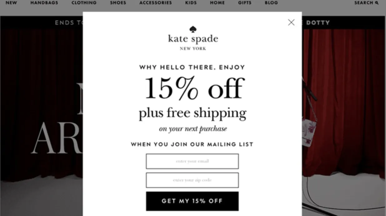
This CTA button (form submission) is for Kate Spade New York’s opt-in page, which prompts people to give them their email address in exchange for receiving 15% off plus free shipping on their next order.
It’s effective because the CTA pops up on the website as people are browsing, suddenly instructing the visitor to take this very specific action. Plus, readers understand their action is inherently tied to a financial benefit – namely, 15% off their next purchase. The CTA button “Get my 15% off” makes it clear that, by providing their email, they’ll get a nice cut off the price removed from their next order.
2. Shaw Academy
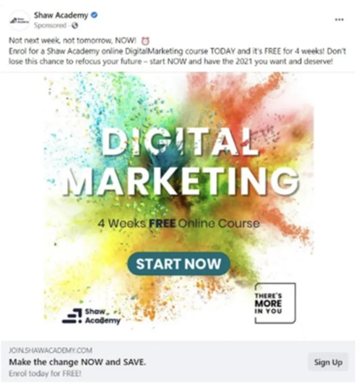
Shaw Academy’s Facebook ad is promoting a digital marketing course through a call to action encouraging viewers to sign up now and save money.
This CTA is well-made because:
- There are multiple CTAs (“Start Now and “Make the change NOW and SAVE”)
- Contrasting colours make the CTA stand out
- There is a sense or urgency to take the action not in a week, or tomorrow, but right now
3. Search It Local
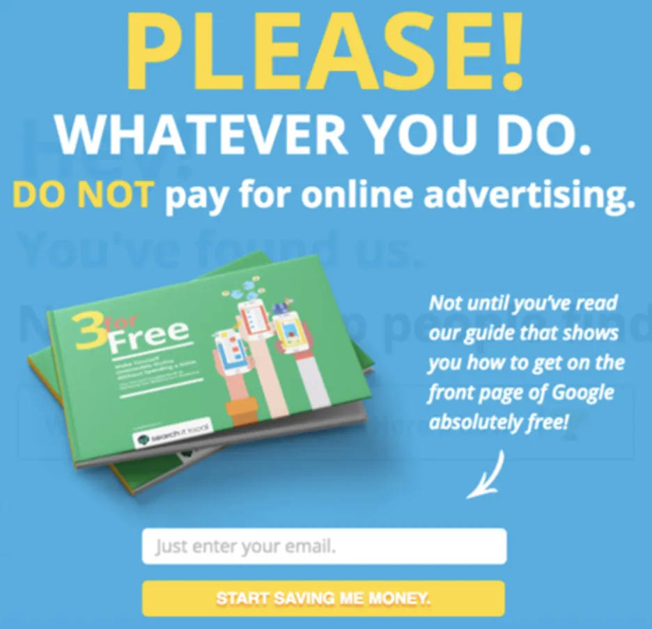
This CTA, another opt-in page and form submission, was crafted by Search It Local to encourage their website visitors to download a guide that shows people how they can save money on marketing through SEO in exchange for providing an email address.
The language they use in their copy is powerful and is wrapped up with a call to action making it immediately clear what benefit their readers will enjoy if they provide their basic contact details.
4. Toms
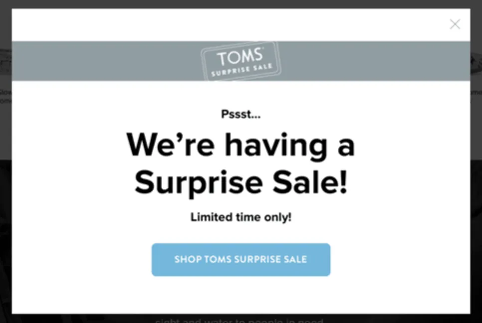
Apparel company Toms crafted this intriguing CTA to pop up when people visit their website. It effectively creates a sense of mystery that makes their customers want to know more through creating a surprise sale. What it does well includes:
- Creating exclusivity by using the word “Pssst” (i.e. that the person viewing it is the only one who is seeing this sale)
- Creating a sense of urgency through using the words ‘Limited Time Only’. It doesn’t specify a date such as ‘until the end of November’, and so cleverly avoids using a timeframe that could give the reader an excuse to delay. Anyone remotely interested in buying will be drawn to the CTA and prompted to click on ‘Shop Toms Surprise Sale’.
- Using a blue button that very clearly contrasts the rest of the pop-up, building that psychological momentum to convince you to click and shop.
5. Samsung
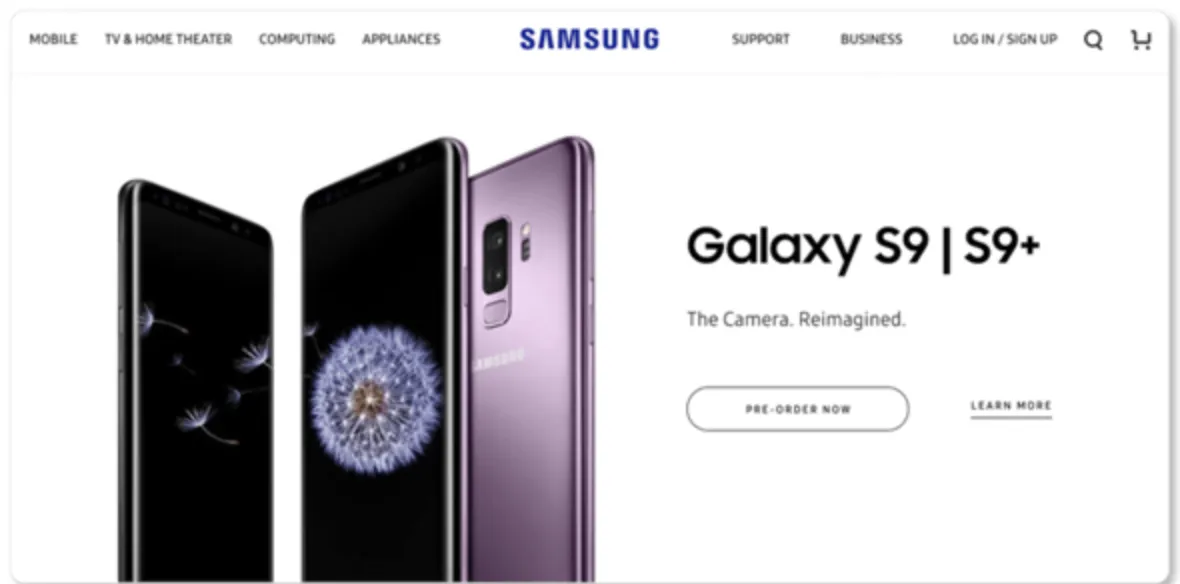
Samsung is one of the world’s largest brands, yet they’re still very aware of the effectiveness of creating a great CTA. In three words, they’re able to tap into the psychological elements of a good call-to-action button. The word ‘now’ not only creates a feeling of instant action, but unlocks the mental impulse statistically shown to boost conversions.
Research demonstrates that around 83% of millennials have made purchases based on impulse. Samsung has mastered this desire, while also enticing people to return later by using the word ‘Pre-order’.
6. Freedom
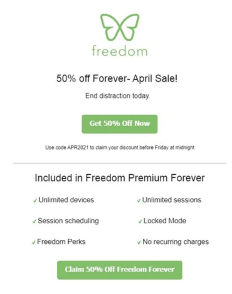
The classic anti-distraction app Freedom has a CTA page that seems subtle, but intentionally so. The main idea is to get you focused on the discount (namely, the green buttons), being the primary message they want you to take action on. The clean design makes the CTAs very clearly stand out, while the secondary CTA is longer and really spells out the benefit that the reader will enjoy upon clicking that button.
7. DotCom Secrets (ClickFunnels)
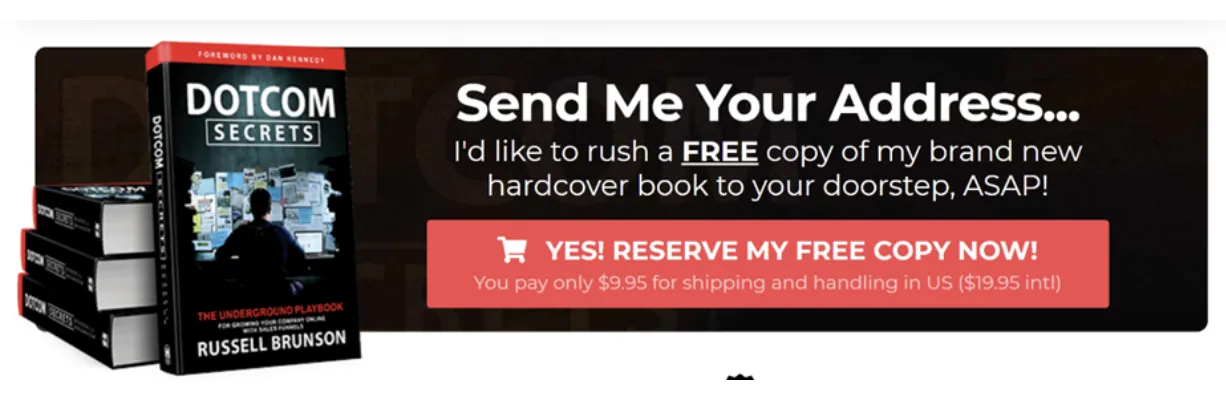
DotCom Secrets is a book written by Russell Brunson, the founder of internet marketing company ClickFunnels. The bright red CTA coupled with the exciting copy encourages you to get a free book. Creating a buzz and excitement aimed at getting the reader ‘psyched up’ to take the action.
The CTA is clearly spelt out and preceded by a “Yes!” to add to the exhilaration of the process. The more defined benefit is outlined at the bottom of the main CTA text to spell out the benefit the reader will experience when making their book reservation.
8. Touchland
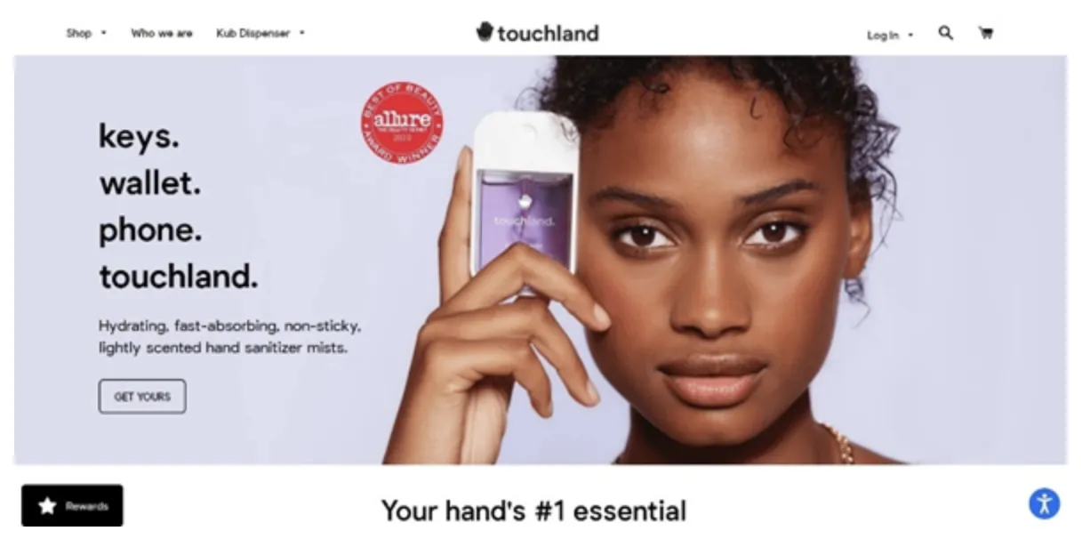
Touchland is the hand sanitiser mist here to keep you clean without being sticky. Their CTA is preceded by the clever ‘keys, wallet, phone, touchland’ to tell the story while highlighting the benefit of the product.
The “Get Yours” CTA Says n two words, that so many people already have one – and you will only fit in the community if you too ‘get yours’. The fear of missing out (FOMO) is a powerful tactic when it comes to CTA building (and copywriting generally),ouchland have clearly seized on that move.
9. NØIE Skincare
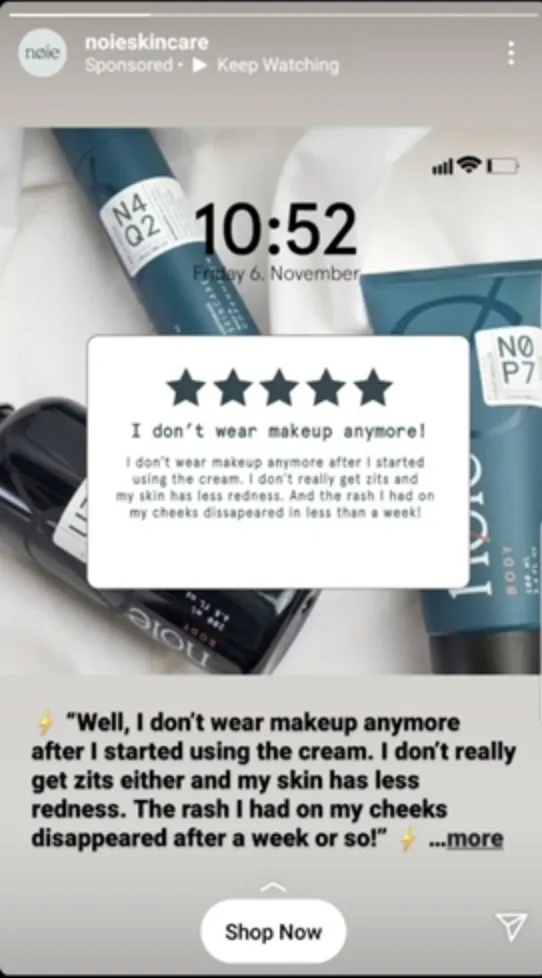
This CTA is rather simple – adopting the commonly used ‘Shop Now’, the reason for its effectiveness is that it is preceded by a powerful ad copy that highlights the benefits you get from making a purchase, rather than the product itself.
“Shop Now”, in any case, is very straightforward and direct. Anybody scrolling through their Instagram stories who come across this ad will know where they will go if they click on the button (namely, the company’s online store).
10. Juvia’s Place
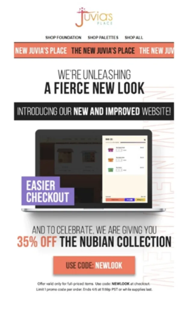
Juvia’s website copy uses large text and bright colours to make it look like a magazine. But the true magic is in the CTA.
By using the text “Use Code: NEWLOOK”, the company is using a coupon code to tempt their customers into buying something immediately by using this special code and getting a discount.
![]()


